


The world map we learned at school is of course a simple and ordinary one. It can point to borders, include capitals of countries, etc. But how would you like to have a world map showing you other data? For example, data on which countries have the most sensual women or what drink they consume most in a country. And yet these world maps exist.
They have been created based on various statistics collected and the result is particularly interesting as you can see strange data about each country in the world. When you travel to a country you definitely see up close some customs, truths and habits. But even when you can’t travel, a map like this gives you interesting answers.
Strange world maps with elements that don’t look like what you know
So look at ten of these strange maps…
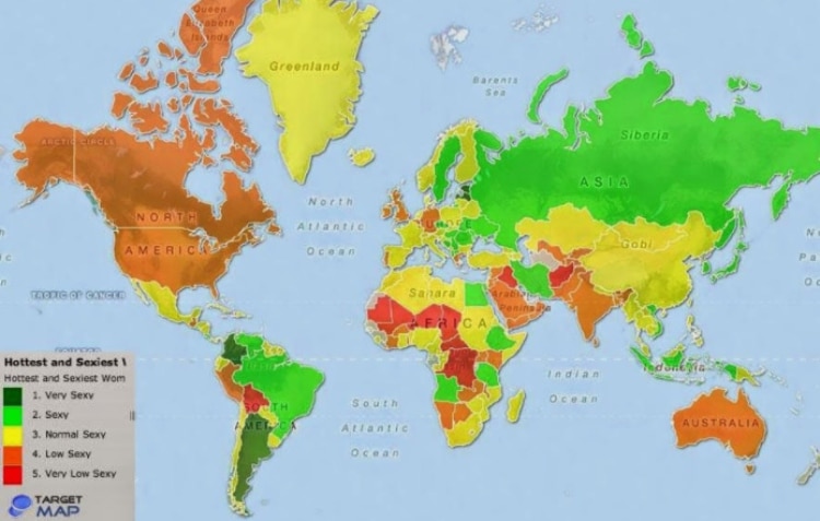
Map of the most sexy women by country
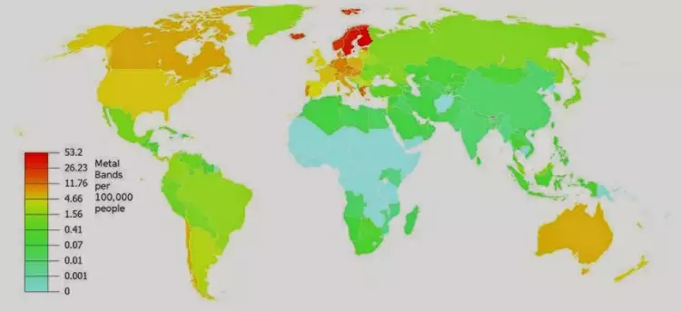
Metal music bands per 100,000 inhabitants
Best place to be born

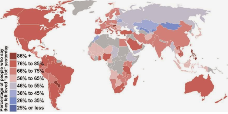
In which countries people feel most loved
World Intelligence Map

Countries and average penis size

The countries with the most people with red hair

Map of good or bad hospitality

Favorite drink by region

EU people aged 25-34 who still live in their parents’ home

Source of external photography? pexels.com
Read also:
The impressive flight attendants who beautify travel
The secret you don’t know about the oxygen masks on the plane
Frequently Asked Questions
Strange world maps are creative visualizations that display unusual statistics and data about countries instead of traditional geographical information like borders and capitals. Rather than showing political boundaries, they highlight interesting facts such as metal music bands per capita, average intelligence by country, or cultural habits. These maps transform data collection into visually engaging infographics that reveal surprising insights about different populations worldwide.
Strange world maps are created based on various statistics and data collected from different sources. These can include demographic studies, cultural surveys, health statistics, and behavioral research. Each map visualizes specific information gathered about countries and regions, allowing creators to present complex data in an easy-to-understand geographical format that shows patterns and comparisons across the world.
Strange world maps cover a wide variety of unusual topics including cultural preferences, physical characteristics, social behaviors, and lifestyle choices. Examples include maps showing which countries have the most metal music bands, where people feel most loved, countries with the highest percentage of red-haired individuals, regional favorite drinks, hospitality ratings, and even demographic information like young adults living with parents. These maps transform everyday statistics into visual stories.
Strange world maps provide interesting insights about countries and their customs without requiring travel. They offer data-driven answers about different cultures, habits, and characteristics of populations around the world. By visualizing statistics geographically, these maps help viewers understand global patterns and learn surprising facts about nations they may never visit, making them valuable educational and entertainment tools for remote exploration.
Strange world maps are based on collected statistics and research, making them as accurate as their sources. However, they often present data in simplified or generalized ways for visual impact. While they can reveal interesting trends and patterns, it's important to remember that maps showing subjective topics like 'sexiness' or 'hospitality' are based on surveys and opinions rather than objective facts, so they should be viewed as entertaining insights rather than definitive truths about entire nations.


